Page Styling
The Page Properties on the right hand panel allows you to add CSS Class names using the CSS Name selector. The selector also filters a Frequently Usedlist of class names, together with classes contained in other CSS files you may have included. The list of class names is filtered depending on the selected control type. Alternatively, the CSS Overrides field can be used to set simple CSS override details (e.g.
background : red;). Note: These overrides are added to the HTML output as inline styles.
Error Message

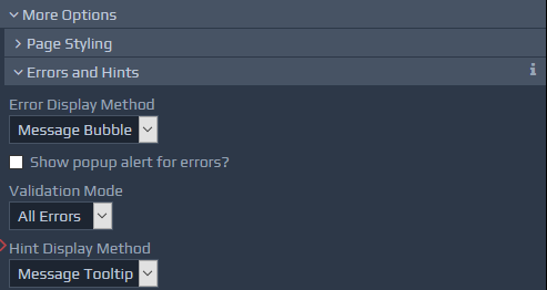
The Error Display Method drop-down allows you to indicate how validation errors should be highlighted on the page. There are three options to choose from:
None - Errors will not be highlighted.
Message Text - This option displays the error message as text, either beside the field or at the top level (see below).
Message Tooltip - This option works in a similar way to the Message Text option, but instead of always showing the error message, a
The Show pop-up alert for errors? checkbox causes a standard popup alert box to appear, listing the errors. This can be used in conjunction with any of the error display methods already mentioned. This checkbox works in conjunction with the Validation Mode drop-down below it. This means pop-up alerts can be setup to either show all errors (i.e. errors for all problematic fields), or for the first error only.
tooltipis used to show the message when the mouse is hovered over the highlighted error field icon. Message Bubble - This option always shows the error message within a speech bubble, with the bubble's pointer linking the message to the related field. This is the default option.
Hint Display Method
The manner in which Hints are displayed can be controlled using the same approach as for the Error Display Method options mentioned above. The two display options available for Hints include Message Text and Message Tooltip.
Top-Level Message
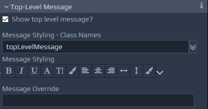
 These settings allow error messages to be grouped together and displayed in one place, generally at the top of the screen. This can be used in conjunction with or instead of local, in-place, the error message settings as described earlier. The Show Top Level Message? checkbox is used to turn this feature on or off. By default, this top-level message is placed at the top of the screen, but it can be positioned and styled as required by specifying appropriate CSS classes or style overrides. The contents of the Message Override box, if entered, are shown within the top-level message container instead of the default approach, which displays a combined list of all the local error messages. For example, there may be situations where you simply want to mention that there are errors on the page, without displaying the full details.
Table of Frequently Used Top-Level Message Styles
| Class Name | Notes on Use |
topLevelMessage |
This applies a bar a the top of the screen with prominent colour and font to list the errors encountered. |
Mark Mandatory Fields
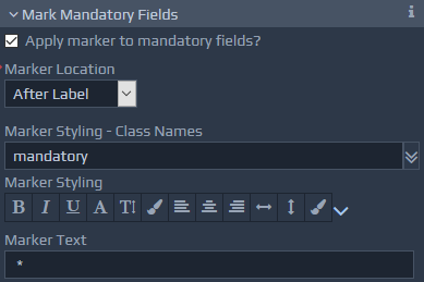
This feature provides the option to add, style and position an indicator against each mandatory field.

Description
Free-format field that can be used to add notes to assist during design.